From Figma to Production

Principal Architect
Staff Software Engineer
TypeScript
CSS-in-JS
Atomic CSS Composition
Design Tokens
Figma
Monorepo
The New Separation of ConcernsInspired by Brad Frost's vision for design systems
Brad Frost wrote something that changed how I think about design systems: the old separation of concerns (HTML for structure, CSS for presentation, JavaScript for behavior) is the wrong abstraction. The better split is between design decisions and their implementation.
A color isn't CSS. It's a decision. A spacing scale isn't pixels. It's a relationship. We built the entire token layer around this insight: capture the decision once, then let it flow everywhere: websites, apps, kiosks, Figma, wherever.

Stupid Simple
Key-Value Pairs All the Way Down

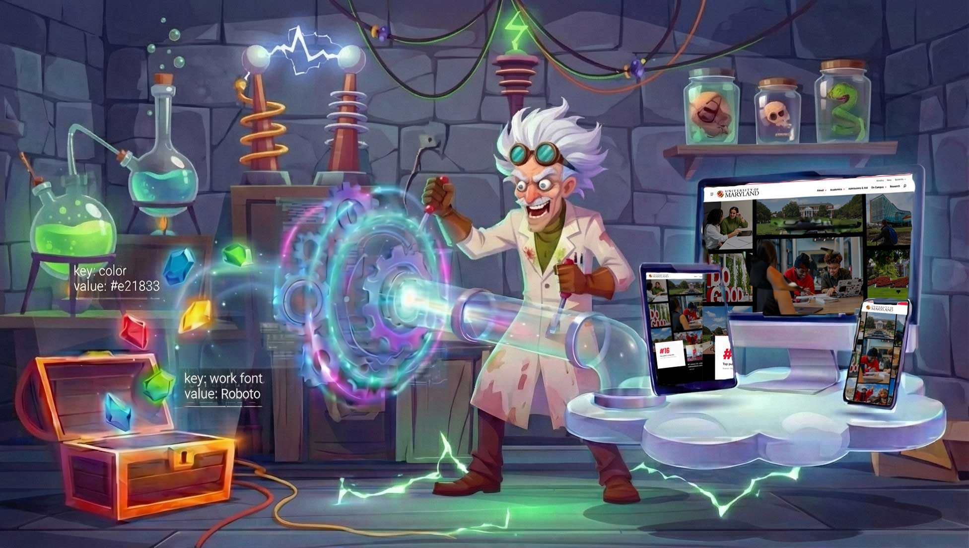
A token is just a key and a value. That's it. Brand red is #E21833. Base spacing is 8px. Body font is Source Sans. The simplicity is the point: there's nothing to misunderstand, nothing to configure wrong.
We export in every format anyone could need:
- JavaScript objects for importing into components
- CSS custom properties for stylesheets
- JSON for tooling and Figma plugins
- TypeScript types so your editor catches typos
The real magic: when the brand team updates Maryland Red from #E21833 to something else (it happens), they change one file. That change cascades through every component, every site, every Storybook story. Nobody hunts through codebases replacing hex codes.
Composition Over Configuration
Building Cards from Primitives

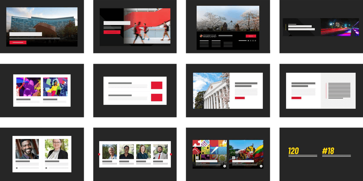
Here's a question: how many card variants does a university need? Block cards, list cards, overlay cards, video cards, person cards, event cards... We counted dozens. Building each one from scratch would mean duplicating accessibility logic, responsive behavior, and animation patterns. Maintaining them would be a nightmare.
Instead, we built atomic pieces that compose:
- Layout primitives: stack, inline, overlay (the bones of any card)
- Typography presets: headlines, body, captions (scaled responsively)
- Asset handlers: images with aspect ratios, lazy loading, backgrounds
- A fluent Element Builder that chains these together
Every card variant is just a different composition of the same primitives. Add a new variant? Compose existing pieces. Fix a bug in the layout primitive? Every card that uses it gets the fix. The atomic approach turned a maintenance headache into a multiplication of capability.
Tokens Travel
The Unexpected Places Design Decisions End Up

We built tokens for websites. Then they started showing up in places we didn't plan:
- Campus kiosks needed the brand colors, and tokens were already there
- Digital signage for events used the same typography scale
- Email templates got the palette via a JSON import
- Figma plugins that sync tokens back into design files
Each platform consumes tokens in its native format. React imports JavaScript objects. PHP reads CSS variables. The email builder pulls from JSON. Same decisions, different implementations: exactly as Brad Frost described.
That's the payoff of treating design decisions as data rather than code: they become portable. Version them. Diff them. Roll them back. Share them across any technology stack without translation errors. The tokens package became the source of truth for the entire university's visual identity.


