
One System
Any Stack

UMD Design System documentation interface showing component library

Principal Architect

Staff Software Engineer

Technical Lead

TypeScript

Web Components

Shadow DOM

Vite

Jest

Storybook

GraphQL

Figma

ES Modules

Brand Consistency Across 1600+ Applications
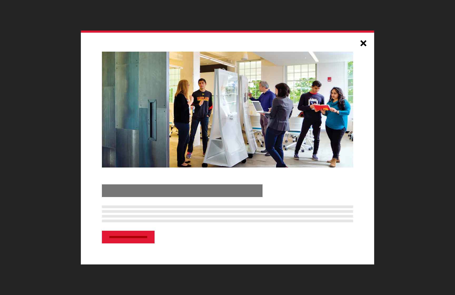
The University of Maryland Design System

A university with 1,600+ web applications, twelve colleges, and zero shared infrastructure. Every team picks their own stack: WordPress, React, Angular, legacy Java, static HTML. Whatever solves their problem.

Building a design system for this environment means building for all of it. No 'just switch frameworks' conversations. No forcing choices. Components that work everywhere or nowhere at all.
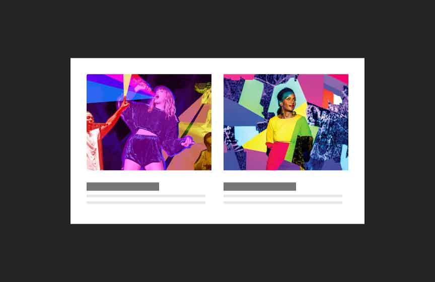
What the Audit Revealed

Patterns in the Chaos

Content inventory showing fragmented design across departments

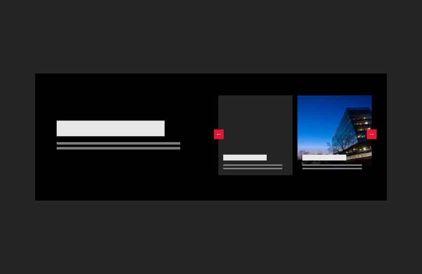
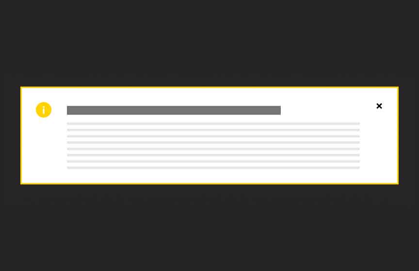
We ran accessibility audits across hundreds of sites. The patterns were clear: the same failures everywhere. Keyboard navigation broken on carousels. Focus states missing on buttons. Color contrast failing on the same brand red. Each team had independently made the same mistakes.

The technical inventory showed something else:

  • Over a hundred implementations of a button
  • Over thirty different carousel implementations, all with accessibility bugs
  • Navigation patterns that worked with mouse but trapped keyboard users
  • Brand colors defined inconsistently, with twelve different hex codes for 'Maryland Red'
  • Performance budgets blown by teams loading entire frameworks for single components

The insight: these weren't individual failures. They were systemic. Teams weren't bad at accessibility; they just didn't have the time or expertise to get it right. Solve the problem once, upstream, and every site benefits.

Why SOLID Still Matters

Old Principles, New Application

SOLID principles are usually taught in the context of object-oriented programming. But they're really about managing complexity at scale. We applied them at the package level:

  • Single Responsibility: Nine packages, each with exactly one job. Tokens hold values. Styles transform them. Components compose elements. Clear boundaries, clear ownership.
  • Open/Closed: Components extend through slots and CSS custom properties, not source modification. Teams customize without forking.
  • Interface Segregation: Import just what you need. A landing page using one button doesn't bundle the entire component library.
  • Dependency Inversion: Components depend on token abstractions. Change a brand color in one place, and every component updates automatically.

These aren't academic concerns. They're what makes the difference between a system that becomes unmaintainable after two years and one that keeps getting better.

The Package Stack

Layers That Compose

Modular package architecture visualization

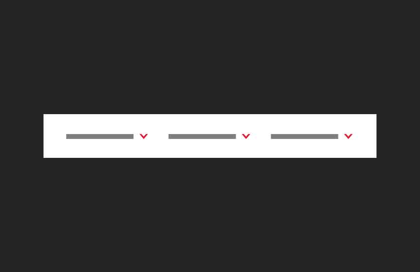
Think of the system as a stack. Each layer builds on the one below, but you can stop at any level:

  • Tokens: Just the design decisions. Brand colors, spacing scales, typography. Use these with your own CSS.
  • Styles: Tokens transformed into utility classes and CSS. Layout primitives, responsive typography, animation.
  • Elements: Atomic pieces (buttons, links, images) that compose into larger patterns.
  • Components: Complete Web Components. Drop in a navigation, footer, or hero with one HTML tag.

A marketing team might use just the playground to configure components. A development team might import tokens and build their own React components on top. Both are valid. Both get the accessibility and brand consistency baked in.

Three Paths to Adoption

Meeting Teams Where They Are

Component configuration options showing millions of combinations

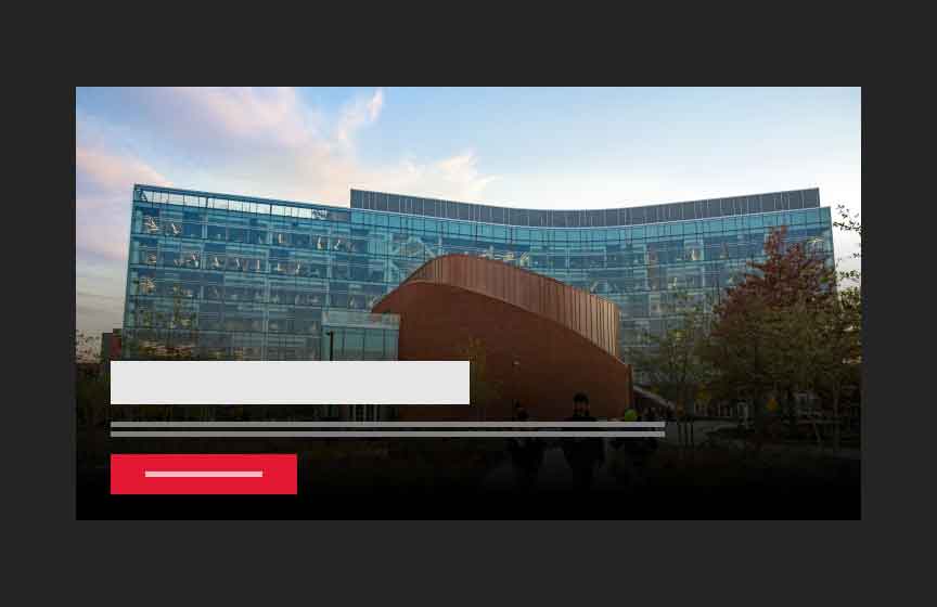
The hardest part of design systems isn't building components. It's getting people to use them. We removed every excuse by offering multiple paths:

  • No-code: The visual playground lets anyone configure components, preview them live, and copy the markup. No code knowledge required.
  • Pro-code: CDN script tags with a simple HTML API. Configure components using slots and attributes. No build tools, no npm, rapid development.
  • Expert-code: NPM packages with full TypeScript definitions, tree-shaking, and lower-level configuration options. For teams with sophisticated build pipelines.

The key insight: all three paths produce identical output. The marketing coordinator using the playground and the engineer importing via NPM get the exact same accessible, tested, performant component. The quality is in the system, not the consumption method.

Proof Points

What Actually Changed

Git contribution graph showing sustained development

Numbers matter, but they're not the whole story. Here's what we can prove:

  • Accessibility scores on adopter sites jumped from below 40% to above 90%. That's not a tweak; it's a transformation.
  • Partner development costs dropped by over 70% in some cases. They stopped paying vendors to rebuild carousels.
  • Over 100 sites adopted in the first year, with the pipeline growing. Word of mouth did more than any mandate.
  • 1,000+ tests run on every pull request. Visual regression catches what unit tests miss.

The less quantifiable change: departments that never talked now share a vocabulary. When everyone uses the same components, conversations shift from 'how do we build this' to 'what should it do.' That's the real win.