Product Design at Scale

Principal Architect
Staff Software Engineer
Product Manager
Typescript
Web Components
GraphQL
Node.js
CSS-in-JS (JSS)
PostCSS
Tailwind
Figma
Storybook
Linear
Open Source
Monorepo
Universal Design for a Decentralized CampusThe University of Maryland Design System
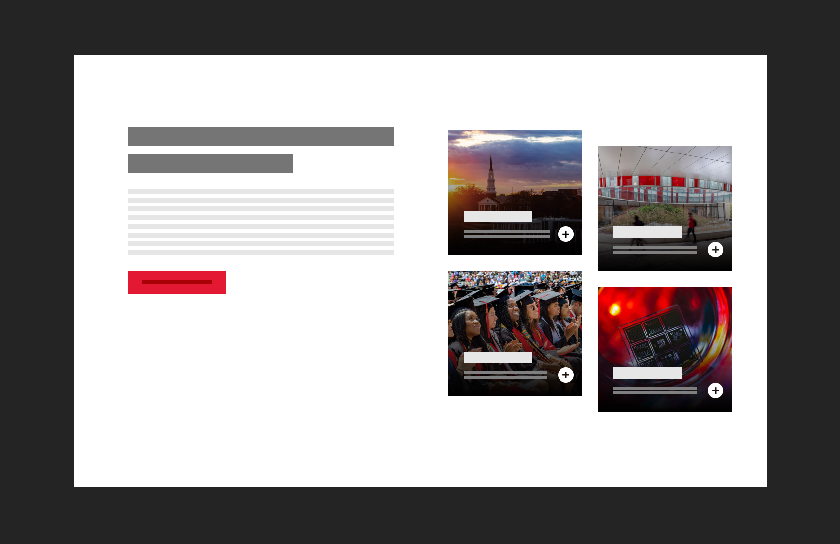
The University of Maryland comprises twelve colleges and schools, six divisions, and over fifty departments, creating a highly decentralized digital ecosystem. This fragmentation resulted in inconsistent branding, varied user experiences, and accessibility compliance challenges. To address these issues, we designed and implemented a scalable, platform-agnostic design system, ensuring brand consistency, accessibility, and ease of adoption across the institution's diverse digital landscape.
As the principal engineer, project lead, and manager of a nine-person team of designers and developers, I guided this initiative from conception to deployment. Over eighteen months, we launched a robust system with over forty Web Components, millions of possible UI combinations, extensive documentation, and a component model, ensuring flexibility and extensibility for campus stakeholders.
Discovering the Goals
Addressing the Complexity of a Decentralized Institution

The discovery phase spanned six months, involving:
- Analyzing the top fifty most trafficked university websites
- Conducting stakeholder interviews, user surveys, and UX testing
- Performing a content inventory across colleges, schools, and divisions
This research revealed significant inconsistencies in design and functionality across university-affiliated digital properties. Given the diverse technical landscape; from PHP-based CMSs and Java applications to static sites hosted in S3 buckets - we needed a platform-agnostic approach that ensured broad adoption.
Inspired by Atomic Design principles, we structured the system with a hierarchical component model that promotes modularity, reuse, and scalability. Leveraging Web Components ensured seamless integration across multiple frontend frameworks like React, Angular, and Vue while enabling backward compatibility with legacy systems.
Engineered Solutions
Removing Barriers to Adoption by removing complexity

The project embraced an agile, startup-style culture, with concurrent design and development sprints, iterative user feedback loops, and stakeholder validation milestones. I led the engineering effort, authoring over 2,000 commits, ensuring performance optimizations, and defining a scalable architecture.
The system evolved into multiple core libraries:
- Styles: A JSS-based (JavaScript Style Sheets) tokenized system managing layout, typography, and elements
- Elements: A JavaScript-driven, atomic component library supporting reusable UI elements
- Feeds: Dynamic components for fetching and displaying content
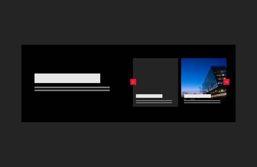
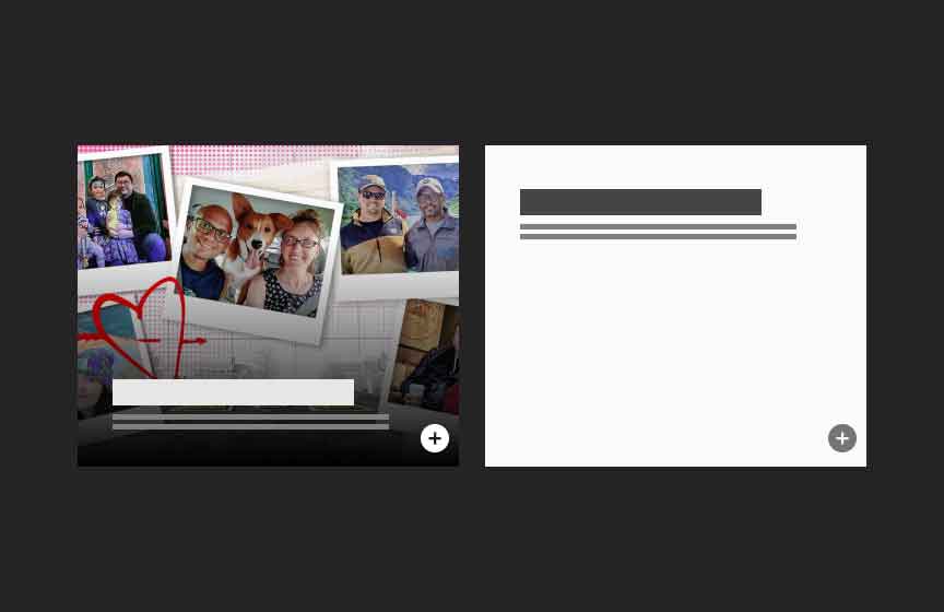
- Components: A compositional interface for assembling UI elements
By integrating these modular layers, we created an extensible, maintainable, and performance-optimized design system that empowered developers to build custom experiences without sacrificing compliance or consistency.
Open Source Adoption Strategy
Comprehensive Documentation to Ensure Long-term Success

Understanding that adoption is as important as implementation, we prioritized comprehensive documentation:
- Storybook Playground: A real-time testing environment that allows developers and content creators to interact with components dynamically before integration. By enabling users to experiment with UI elements in an isolated environment, the Storybook Playground significantly reduces implementation errors and accelerates onboarding for new developers. This interactive approach ensures that consumers can validate component behavior, explore variations, and integrate them confidently into their applications.
- Marketing Toolkit: A resource hub featuring: Best practices for adoption, Common design patterns and UI templates, Responsive variations and component guidelines.
By democratizing access to these resources, we ensured the system's usability for developers, designers, and non-technical users.
The Impact
A Transformed Digital Ecosystem rooted in Scalable Principles

The University of Maryland Design System launched with its five core principles fully realized:
- Consistency: A unified digital experience across university entities
- Accessibility: WCAG 2.2-compliant, ensuring inclusivity for all
- Scalability: A future-proof foundation for growth
- Simplicity: A straightforward implementation process
- Adaptability: A flexible system catering to varied technical needs
The system's success is evident in measurable outcomes:
- Reduced redesign project scope by over 60%
- Lowered vendor costs for campus partners by 40%
- Deployed across numerous university sites, establishing the digital foundation for future projects
The University of Maryland's Design System demonstrates how engineering excellence, thoughtful design, and strategic leadership can transform fragmented digital experiences into a cohesive, scalable ecosystem. By combining technical innovation with human-centered design, we delivered a product that serves as the university's digital backbone, ensuring its adaptability and relevance for years.
